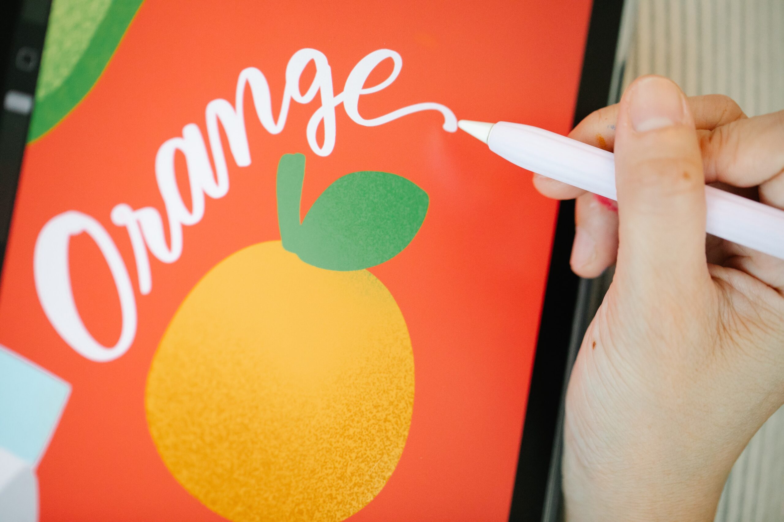
When it comes to designing food labels, it’s crucial to strike a balance between creating visually appealing food labels and providing all the necessary information to your customers. Your food labels are one of the primary tools you have to communicate with your customers, especially if you’re a small brand with a limited marketing budget.
Mistake #1: Too Many Fonts
When designing your food labels, it’s easy to get carried away with all the font options available to you. However, using too many fonts can make your food labels appear disjointed and confusing, making it difficult for your customers to read and understand.
To avoid this mistake, stick to one or two fonts for smaller food labels, and keep style changes to a minimum. This will help create a cohesive and easy-to-read design that will appeal to a wider range of customers, including those with vision challenges.
Mistake #2: Brand Name Type Size is Too Big or Too Small
Finding the right balance between the size of your brand name text, product info, and other copy on the food labels is essential. You don’t want your brand name to get lost in the label, but you also don’t want people to miss out on the important details of your product.
To strike the right balance, make your brand name more prominent and place it above the other information. The product name should be second in size, followed by other information.
Mistake #3: Font is Hard to Read
Your food labels only have a few seconds to catch a shopper’s attention, which means that you need to ensure your product’s name and message are easily spotted. To achieve this, choose clean fonts that are clear and easy to read from a distance or up close.
Avoid using decorative fonts, as they can often send a mixed message that clashes with your brand image. Instead, stick to fonts that complement your logo font. San serif fonts are usually easier to read at small sizes, such as for your ingredients list.
When designing your food labels, it’s a good idea to come up with a couple of different versions to test on co-workers to see their reactions. This will help you determine the most effective design and font selection for your product.
Mistake #4: Clashing Colors
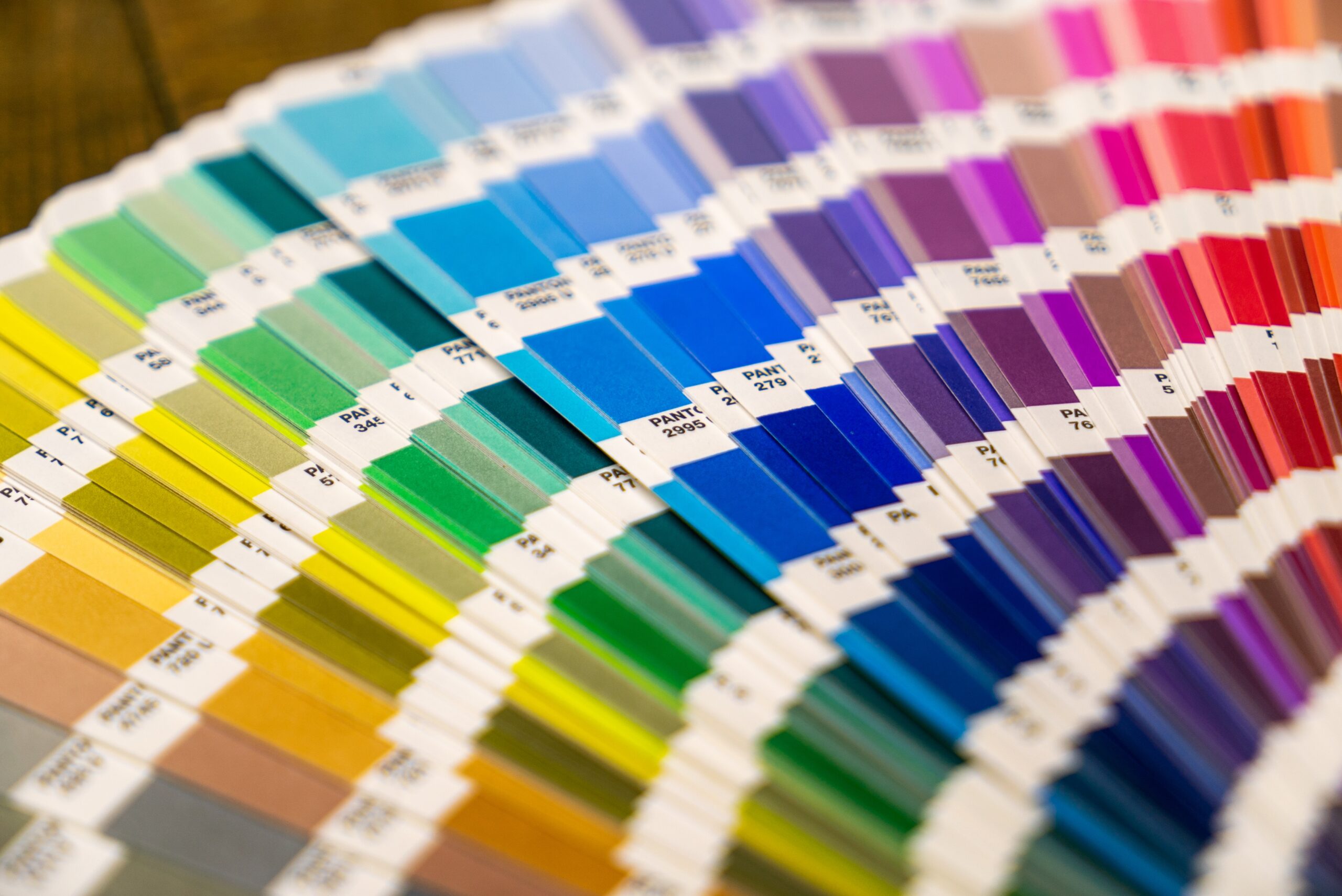
When it comes to selecting colors for your food labels, it’s important to remember that not all colors work well together. In fact, some color combinations can clash and create an unpleasant visual experience for the viewer. This can make it difficult to read the text on the food labels, and even make the product look unappealing.
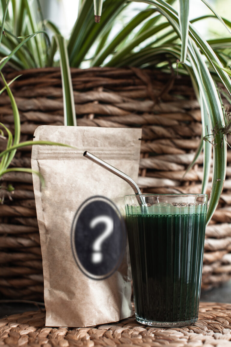
Mistake #5: Crowded Images
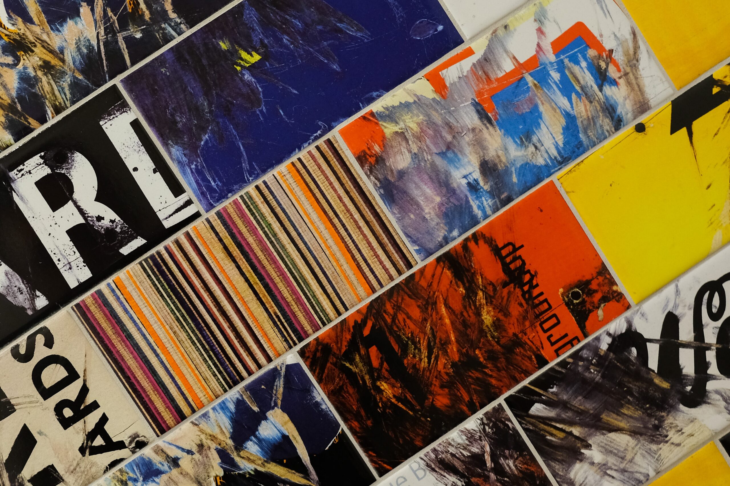
Another common mistake in food label design is using too many images. While images can be a powerful tool in capturing the attention of potential customers, too many images can make it hard to focus on what you’re trying to sell.
Mistake #6: Mixed Messaging
Finally, when designing your food labels, it’s important to consider the message you want to convey. When selling food, you want your label to communicate that your product is delicious, healthy, and clean. It should look good enough to eat! In the example above, the forklift is a totally unnecessary pun that doesn’t work with the company name. Plus, a greasy forklift might be the last thing you want to see related to a cupcake.
The Future Beckons: Final Remarks to Stay Ahead with Cutting-Edge Solutions
Whether you’re having a label manufacturer print your food labels or you’re printing them yourself in-house, with an Epson or QuadraColor label printer, a good food label design is essential. By avoiding these common font mistakes, you can create visually appealing and effective food labels that communicates your brand story and appeals to a wider range of customers.
Designing effective food labels takes careful consideration of multiple factors. In addition to font selection and size (discussed in Part I), you also need to consider layout and color. Remember to pick colors that complement each other and don’t clash, avoid using too many images, and make sure your message is clear and consistent. Your food label is your brand and a reflection of your company, so make sure it looks professional and communicates the right message to potential customers.